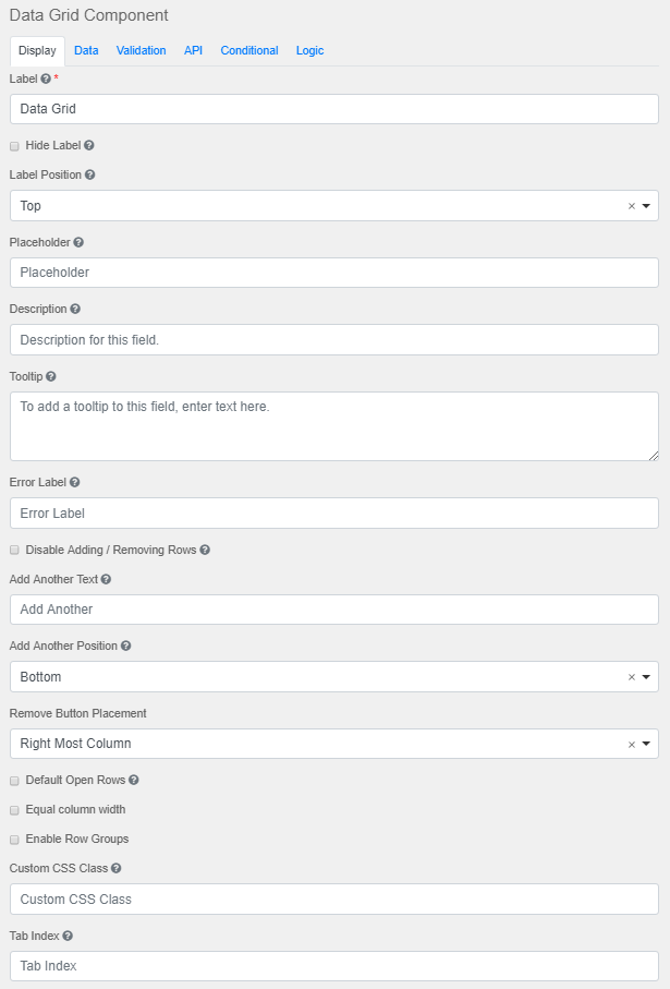
Label
The name or title for this component.
Hide Label
Hide the label of this component. This setting will display the label in the form builder, but hide the label when the form is rendered.
Label Position
Position for the label for this field.
Placeholder
The placeholder text that will appear when this field is empty.
Description
The Description is text that will appear below the input field.
Tooltip
Adds a tooltip icon to the side of this field.
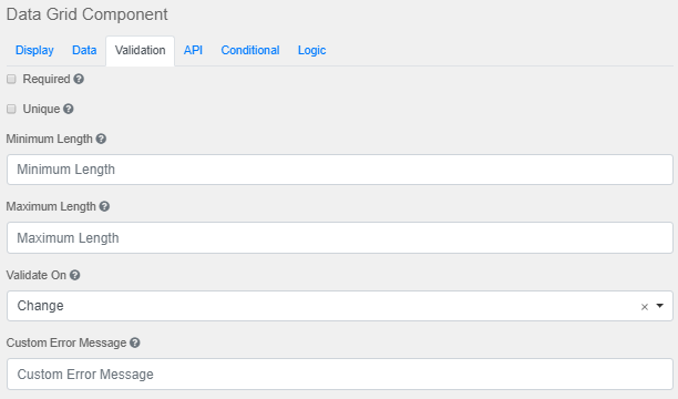
Error Label
The label that will display for the field when a validation error message is shown.
Disable Adding / Removing Row
Check to hide 'Add Another' and 'Remove Row' buttons.
Add Another Text
Sets the text for the 'Add Another' button.
Add Another Position
Position of the 'Add Another' button with respect to the Data Grid array.
Remove Button Placement
Removes the button placement.
Default Open Rows
Opens the rows with existing values by default.
Equal Column Width
Creates equal widths for every column in the data grid.
Enable Row Groups
Rows can be divided into groups with labels.
Custom CSS Class
A custom CSS class to add to this component. Multiple class names can be added, separated by a space.
Tab Index
Sets the tabindex attribute of this component to override the tab order of the form.
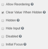
Allow Reordering
Allows change of multiple values using drag and drop.
Clear Value when Hidden
Clears the value when the field is hidden
Hidden
Remains part of the form but is hidden from view.
Hide Input
Hides the input in the browser.
Disabled
Disables the form input.
Initial Focus
The field becomes the initially focused field on the form.
|


