|
Reference > Solution Designer > Design > eForms Object > eForms Components > Advanced Components URL |
Scroll |
|
Enables URL links to be added to the form. |
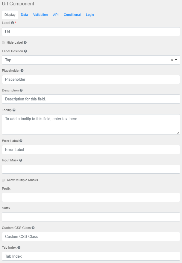
Label The name or title for this component.
Hide Label Hide the label of this component. This setting will display the label in the form builder, but hide the label when the form is rendered.
Label Position Position for the label for this field.
Placeholder The placeholder text that will appear when this field is empty.
Description The Description is text that will appear below the input field.
Tooltip Adds a tooltip icon to the side of this field.
Error Label The label that will display for the field when a validation error message is shown.
Input Mask An input mask helps the user with input by ensuring a predefined format. For a phone number field, the input mask defaults to (999) 999-9999. ●9: numeric ●a: alphabetical ●*: alphanumeric
Allow Multiple masks This setting will allow you to set multiple input masks for the field. The mask is selected by the user via a drop-down list and will dynamically switch the mask for the field when selected.
Prefix The text to show before a field. An example is ‘$’ for money.
Suffix The text to show after a field. An example would be ‘lbs’ for weight.
Custom CSS Class A custom CSS class to add to this component. Multiple class names can be added, separated by a space.
Tab Index Sets the tabindex attribute of this component to override the tab order of the form.
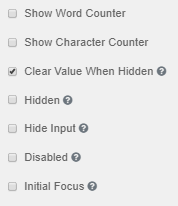
Show Word Counter Disables the number of words in the field.
Show Character Counter Disables the number of characters in the field.
Clear Value when Hidden Clears the value when the field is hidden
Hidden Remains part of the form but is hidden from view.
Hide Input Hides the input in the browser.
Disabled Disables the form input.
Initial Focus The field becomes the initially focused field on the form. |
|---|
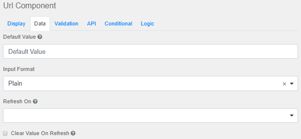
Default Value Overrides the placeholder text. This will be the value for this field before user interaction.
Input Format Select from Plain, HTML or Raw formats.
Refresh On Refresh data when another field changes.
Clear Value On Refresh Clears the components value when the field has refreshed.
Allow Manual Override of Calculated Value Manually overrides the calculated value. |
|---|
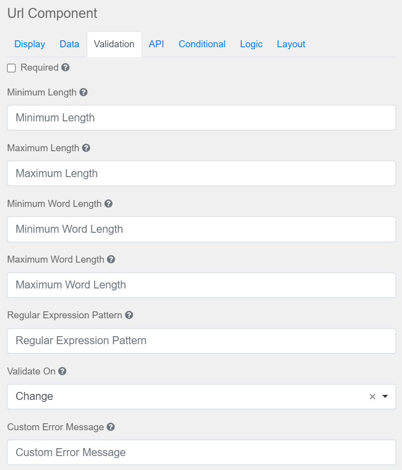
Required A required field must be completed before a form can be submitted. Indicated by an asterisks on the form.
Minimum Length The minimum length requirement that this field must meet.
Maximum Length The maximum length requirement that this field must meet.
Minimum Word Length The minimum amount of words that can be added to this field.
Maximum Word Length The maximum amount of words that can be added to this field.
Regular Expression Pattern Tests that the field value must pass before the form can be submitted.
Validate On Determines when this component should trigger front-end validation.
Custom Error Message Custom error message displayed when an error occurs.
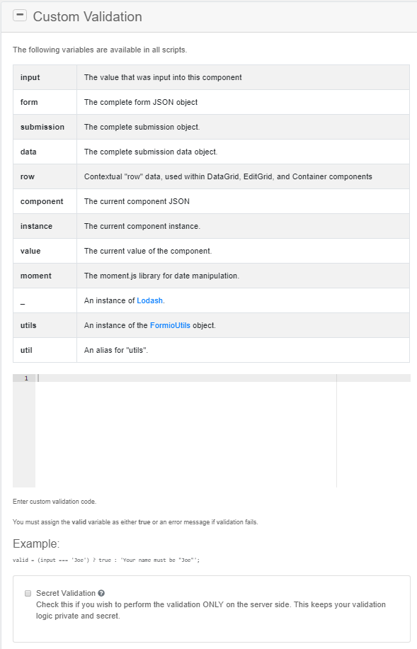
Secret Validation Check this to perform validation on the server side only; this maintains the privacy of the validation logic.
|
|---|
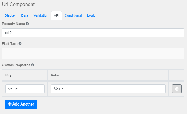
Property Name Names the field for the API endpoint.
Field Tags Tags the field for use in custom logic.
Custom Properties Enables the configuration of any custom properties for this component.
Add Another Adds another configuration row. |
|---|
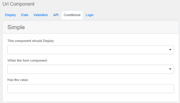
This component should Display Select between 'True' or 'False'
When the form component Select from the list of form components.
Has the value Enter a value for the condition.
|
|---|
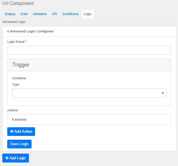
Logic Name Gives the logic a label
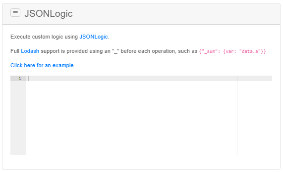
Type Select between Simple, Javascript, JSON Logic or Event.
Add Action Adds another action to the logic.
Save Logic Saves the current logic list.
Add Logic Adds another Logic for configuration. |
|---|


